
How Are You Being Evaluated
This product design interview question tests whether you understand the process of going from customer needs to product development. This process involves determining who the customer is, understanding what they want to accomplish, defining multiple use case scenarios, prioritizing what to build and having good business acumen.
The interviewer is evaluating you on the following:
- Can you empathize with customers? Can you articulate their needs, feelings, and expectations?
- Are you able to provide multiple and diverse use case scenarios?
- Is your answer structured and logical, or do you ramble?
- Do you go beyond generalities in your solutions and provide detailed descriptions?
- Can you provide ideas that no other candidate has mentioned?
- Are you confident and sound credible? Would engineers and other team members follow your lead?
Answer Structure
To come up with innovative design ideas, you need to understand what the user wants to do relative to the product you are building. Clayton Christensen refers to this as the “job” your users want to get done in the book Competing Against Luck. A “job” refers to the progress your user wants to achieve in a particular circumstance. If you define what this means for your user, you will gain clarity on what the key goal of your product should be. This should be the first step.
The next step is to design innovative solutions to help users achieve their goals. To do this use one of the following two techniques: create a customer journey map or list use cases. We will use a customer journey map. We chose this technique because, in the case of a phone home screen, there is a path a user goes through to achieve their goal. Describing the customer’s journey will help reveal what the user wants or expects to achieve at a particular stage on their journey. And, this revelation will help spark ideas for new features.
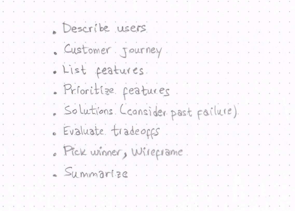
Here is a structure for working on this question using the customer journey technique:
- Ask clarifying questions.
- Identify user types and decide if you need to prioritize one or more.
- Define the “job” to be done for the target user.
- Describe the customer’s journey to uncover user needs.
- List features that address those needs.
- Prioritize features.
- Brainstorm solutions.
- Evaluate the trade-offs of each solution.
- Summarize: state the problem, what the solution does, and why it is the best solution.
Answer Example
INTERVIEWEE: I believe Facebook launched a home screen feature in 2013. Am I correct?
INTERVIEWER: Yes, but it was not successful.
INTERVIEWEE: Why?
INTERVIEWER: The feature was called Facebook Home. It failed because Home prioritized displaying Facebook content when users’ main pain point was to access their favorite apps. The feature covered the device’s screen with a feed of Facebook photos, notifications, and posts. It was a beautiful interface, but it missed the crucial fact that users wanted direct access to their favorite apps and widgets. Facebook Home did have an app launcher that provided access to apps, but it took too many clicks to access them.
INTERVIEWEE: So, why try it again?
INTERVIEWER: Well, if we can design a home screen that appeals to the majority of users, we think we can increase engagement across many Facebook properties.
INTERVIEWEE: So, is the business goal to increase engagement of Facebook properties?
INTERVIEWER: Yes.
INTERVIEWEE: Is there any particular region that this new home screen will be targeted to?
INTERVIEWER: The US and Europe. They represent a large percentage of Facebook users.
INTERVIEWEE: Okay, could I take a moment to think about how I will approach this question?
INTERVIEWER: Yes, please do.
(The interviewee takes a minute to write down how she will structure her analysis.)
INTERVIEWEE: Okay, so Facebook Home failed because the design did not take into account a key user need: to have fast access to apps that will help them get a task done. Granted Facebook is an immensely popular app that people access several times a day. But, it is not the only app they use. So, I would like to take a different approach and prioritize the user’s needs relative to the use of a home screen. I will start by analyzing the customer journey towards discovering and using apps. Along the journey, I will identify the user’s needs, list some features to address those needs, and then brainstorm some solutions. At this stage, I will consider ways to include features within the home screen to get users back into Facebook properties. If users find the new home screen valuable, they will start using it frequently. And, as users are exposed to other Facebook properties within the home screen, they will likely use them more frequently. How does this sound?
INTERVIEWER: Sounds good, please proceed.
INTERVIEWEE: Facebook users come from all demographics and lifestyles. Some users are more tech-savvy and may like to customize the presentation and organization of their app icons. But, I think most users do not want to deal with customizations. In the end, the main reason they are using apps is to get something done. And, the faster they can access the app they need, the faster they will get a job done. Therefore, I think the goal of the new Facebook home screen feature should be to help users get things done faster. In the context of the home screen, this can mean finding or opening an app faster, or something else.
Let’s walk through a typical user journey to find and use apps to get things done. This process will provide insights into what actions need to be sped up.
- A user presses the home button and sees the apps screen.
- The user looks for a particular app.
- The user cannot visually identify the app and resorts to search using a text-based search or voice search.
- The user finds the app icon and touches it to open.
- The user may want to switch to another app.
I think this workflow can be improved to help users get things done faster. Here are some ideas for features:
Present the most appropriate app icons to the user when needed.
With gazillion apps available, it is increasingly difficult to find an app visually. Taking the time to organize apps into folders is not a good solution because it is hard to remember which folder an app is in. Plus, it is unlikely users enjoy the chore of organizing apps.
Open the most appropriate app automatically.
Instead of just presenting the most appropriate apps for the user, why not open them automatically?
A quicker way of switching from app to app.
Create a way for the user to switch to another app, without having to go through the process of finding an app again.
To decide on which feature to prioritize for development, I will now compare them against four attributes:
- How important is the user’s pain point the feature solves,
- How innovative is the feature relative to competitors’ features,
- How much effort will it take to build,
- And how risky it is to build the feature.
To numerically prioritize the features, I will use a scoring system, from 1 to 5, to rate a feature across these attributes. I will add the positive attributes and subtract the negative ones. The positive attributes are: “importance of pain point” and how “innovative” is the feature. And, the negative attributes are: “effort” to build the feature and “risk” level.
I will make the comparison using a table.
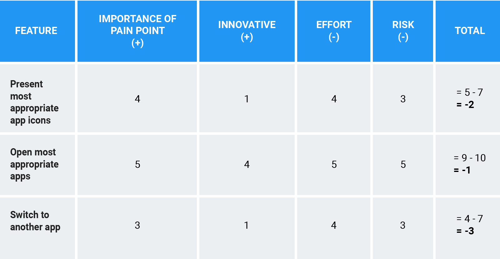
Pain Point Attribute
Let me start by rating the feature on the “importance of pain point” attribute. The feature, “open the most appropriate apps,” addresses a key pain point towards achieving the goal of helping users get things done faster. Of the three, this feature provides immediate access to apps the user wants at the right time. Therefore, I give it 5 points.
The “present most appropriate app icons” feature is similar, but it only displays the app icons. It does not open the apps. So, I give it a 4.
And, the “switch to another app” feature addresses a less critical pain point, since not all users may want to switch to another app. So, I give it a 3.
Innovation Attribute
For innovation, I think the “open the most appropriate apps” feature is the most innovative of the three because it does not exist as far as I know. Therefore, I give it a 5.
The “present the most appropriate app icons” feature is something that competitors like Aviate already do. Aviate has an app launcher that presents the right app icons at the right time. The app analyzes what the user is doing, the context, and displays the most relevant apps for that context. For example, if a user is travelling, the app will show the user’s Google Maps app, navigation apps, and Yelp. Therefore, I give this feature a score of 1 for innovation.
The “switch to another app” feature is something Aviate already solves. So, I give it a score of 1 too.
Effort Attribute
For Effort, I think the “open the most appropriate apps” feature takes more effort than the “present the most appropriate app icons” feature. Because it involves finding the right apps based on context and designing the UI to display opened apps, I give it 5 for effort.
The other two features: “present the most appropriate app icons” and “switch to another app” use the same algorithm to select apps as the “open the most appropriate apps” feature. But, the UI design is less demanding. So, I give both of these features a lesser score of 4.
Risk Attribute
For risk, I think the “open the most appropriate apps” feature is the riskiest to develop because it chooses which apps to open on behalf of the user. While the other two features let the user decide which app to open. In the first case, the user will blame the feature if an app is not visible right away. While in the second case, the onus is on the user to open the app. So, I give the “open the most appropriate apps” feature a 5 for risk, and 3 to the other two features.
After summing up the rows, the “open the most appropriate apps” feature ranks the highest, so I would prioritize this feature for development.
INTERVIEWER: Okay. Next, can you think of a few designs for this feature?
INTERVIEWEE: Sure, I can think of two.
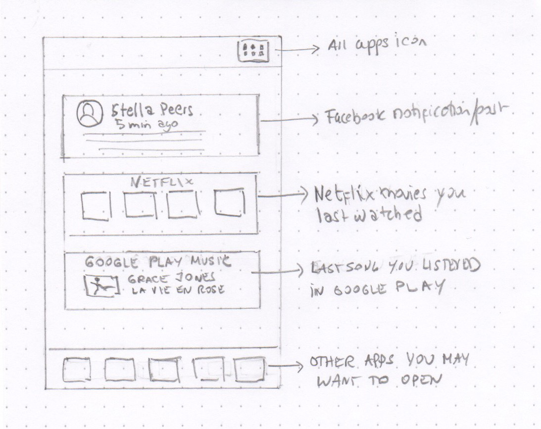
The first design displays content of the most frequently used apps in a table view. The table view presents an app’s partial content inside a cell and lists the apps in order of importance to the user. The user can scroll up or down and select the app they want to display in full-screen mode.
To get users to use Facebook apps, I would display these apps at the bottom of the screen in the Tab Bar. This way, users would have easy access to Facebook apps, like the regular Facebook app, Messenger, and Instagram. Also features within the regular Facebook app, like Marketplace and Live, could be displayed in the Tab Bar to enable direct access. Also, if there are Facebook posts where the user was tagged, those can be shown on the list. The post disappears after being viewed.
I think it is important to provide easy access to all apps outside the FB home screen. There are users who would still want the option to go to the apps screen to view all their apps. For these users, I would design an icon that takes users to the apps screen when touched. And, to get back to the Facebook home screen, the user could touch a back button on the app’s navigation bar. Let me sketch what I have in mind.
INTERVIEWER: Nice, thank you. Tell me, how would you choose the most appropriate apps to present?
INTERVIEWEE: I would use a supervised machine learning algorithm to classify which daily scenario the user is in, and then display the user’s favorite apps for that scenario. For example, if it is morning and the user is at the gym and walking on a treadmill, this is a particular scenario. And, in this scenario, the user may have some favorite apps, like a favorite music streaming app, or a favorite video streaming app, or a favorite news app, or a favorite exercise app. Inputs to the algorithm to classify the particular context can be the time, the user’s location, the user’s motion, and the types of apps used by the user. Then apps used by the user in those situations can be grouped and display to the user ranked by frequency of use.
INTERVIEWER: Okay, how about your second solution?
INTERVIEWEE: This solution is inspired by the idea of the super app, like WeChat. Make the Facebook home screen the main portal to everything the user needs to get a job done. This is what WeChat does, except WeChat is a messaging platform. In addition to providing access to all apps, WeChat enables the user to interact with services and transact. Messaging capabilities are critical to enable the user to communicate back and forth with services.
So, I propose making the Facebook Home Screen a messaging-enabled feature. We would still apply the idea of displaying only the most appropriate apps and service apps to the users, but with this solution, the user can communicate and transact. Lifestyle activities — making appointments, scheduling a service, talking to customer service, and ordering food — would be possible from the Facebook Home Screen.
INTERVIEWER: Okay, that is ambitious. Do you see any issues with these two solutions?
INTERVIEWEE: The main issue that I see with the first solution is that personalization of the apps can get in the way of the user finding new apps. This solution stifles variety, and the user can become bored of the same apps. One way to solve this would be to have a section, perhaps at the end of the table, that displays new suggested apps. And, the new apps could be picked based on which apps are trending.
An issue I see with the second solution is that competitors might view it as a monopolistic business threat. Since there are 2B+ Facebook users worldwide, Facebook has a distinct advantage over other businesses when it comes to having access to users. So, I can see how this could be a contentious issue among regulators, particularly in the US and Europe.
INTERVIEWER: Okay, those are good points. Which solution would you implement if you were to choose one?
INTERVIEWEE: Of the two solutions:
- Context-based display of content of the rights apps at the right time and
- A super home screen
I think the first solution achieves the immediate user goal — to get things done faster. It is less ambitious than the second solution, which means it is less risky. The second solution achieves the goal too, but it is much more ambitious and very risky. It is riskier because of possible regulatory hurdles and uncertainty about how western users would like it. Although Chinese users like using WeChat as the portal for everything, people in the western world may not react the same way. So, I would go with the first solution. It achieves the goal of helping users get things done faster and is less risky.
Would you like me to summarize my recommendations?
INTERVIEWER: Yes, please do.
INTERVIEWEE: Since the main reason for the failure of Facebook Home in 2013 seems to be that it hindered users from having fast access to their favorite apps, I proposed something different. I suggested designing a home screen that prioritizes the user’s key goal: to get things done faster with their phone. The solution I recommended is a context-based solution that displays partial content of the right apps at the right time in a table view. I preferred this solution over the second one, the super home screen, because it solves the user’s key pain point and is less risky. This new home screen adds great value to the user, and therefore the user is likely to use it very frequently. As a result, users will engage more frequently with the other Facebook properties displayed on the home screen, achieving the desired business goal.