
How Are You Being Evaluated
This product critique interview question tests whether you can articulate basic principles of good design and whether you can evaluate product designs based on those principles.
The interviewer is evaluating you on the following:
- Are you knowledgeable about basic design principles?
- Do you actively use design principles when thinking about products?
- Do you provide a structured answer or do you tend to ramble?
Answer Structure
We suggest structuring your answer in the following way:
- Explain which design principles you use to evaluate a product.
- Pick a product and describe what it does and what problem it solves.
- List three design principles you will use to evaluate the design of the product. (e.g., It is understandable, useful, usable, efficient, provides a delightful user experience, communicates well with the user, etc.)
- Describe what you like and dislike about the product based on these design principles.
- Recommend improvements.
- Summarize your analysis.
Answer Example
INTERVIEWEE:
Design Principles
Okay, there are a few key design principles I use to evaluate products. These are usefulness, understandability, efficiency, good user experience, and communication with the user. To be more precise, let me explain what each principle means to me.
- Usefulness. The product is useful if it solves the problem it purports to solve.
- Understandability. The product is easy to use and is intuitive.
- Efficiency. The product solves a problem efficiently or minimizes work for the user.
- User experience. The product delights the user.
- Communication. The product provides the necessary feedback to a user to dispel confusion or avoid mistakes.
Now that I have established which criteria I use to evaluate product designs, I would like to use a product as an example. Microsoft OneNote is a product I used to use often, but I stopped because of product design issues.
The Product
Microsoft OneNote is a tool for editing, organizing and sharing notes. Its key differentiator from competitors is its ability to provide free-form note taking without layout restrictions. Users can write on a page, insert any media, or draw anywhere on the page. The app feels like you are taking real notes on a piece of paper. It also enables collaborative editing and a way to organize notes into notebooks. In a nutshell, OneNote is like Evernote but with free-form editing. The target user is anyone who needs to take notes such as students, journalist, and office workers.
OneNote has good and not so good parts when it comes to design. I will use the following design principles to evaluate the good and bad: usefulness, ease of use, efficiency and user experience.
Good Design Choices
On the positive side, here’s how OneNote got it right.
Usefulness. The free-form editing mimics the natural process of jotting things down on a piece of paper. It allows the user to quickly write or draw without worrying about how to layout or format the content.
Ease of use. The OneNote main menu follows the standard ribbon format of the most popular Microsoft tools such as Word and Excel. Therefore, most people already know where to find editing features. For example, the File, Edit, and Insert menu items are where one would expect them to be.
Efficiency. OneNote has made it efficient to insert online snippets of content with a Web Clipper feature. This feature is extremely beneficial, especially for students that do much research for projects online.
Bad Design Choices
On the downside side, here’s where OneNote needs some work.
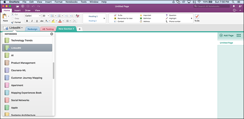
Efficiency and User Experience. The navigation used to display notebooks is a drop down list with a flat hierarchy. This design is not efficient and does not scale with increasing number of books. For example, the height of the drop-down list covers ⅔ of the screen, so only about 10 notebooks can be displayed. If there are more than 10 notebooks, a scrollbar appears allowing you to scroll through the rest of your notebooks, again 10 at a time. This is not a scalable design. If you have more than 70 notebooks, scrolling becomes a drag, especially if the notebook you are looking for is at the bottom. This situation results in more work for the user, making the UI inefficient and compromising the user experience.
Efficiency and User Experience. It is unclear how OneNote orders notebooks in the list. The default is not alphabetical, and there are no sorting options. To search for a notebook, users have to scroll down the list until they see the notebook title they are looking for. And if the notebook happens to be at the bottom of the list, the repetitive scrolling is inefficient and lessens the user experience.
Efficiency and User Experience. Another problem is that notebook management tasks like renaming and deleting notebooks can only be done via the online OneNote application. OneNote does not enable these notebook management tasks in the desktop application. So even though the desktop and online versions are supposed to be in sync, notebook management operations are one-sided. This asymmetry of capabilities between the desktop and online version adds inefficiencies for the user and decreases the user experience.
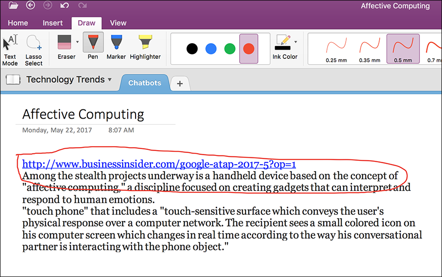
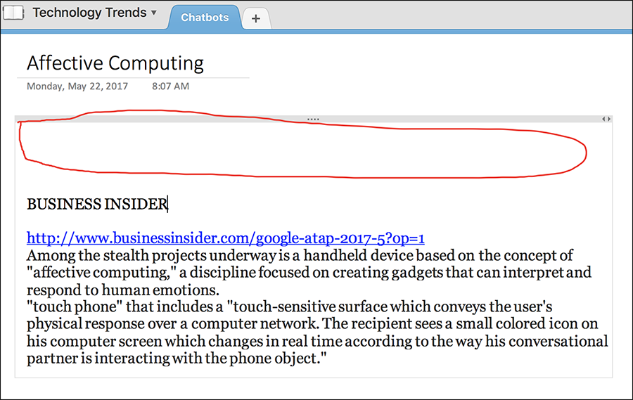
Usefulness. OneNote has a drawing feature that lets users draw freeform lines as if they were drawing by hand with a pencil. This drawing feature is useful to mark or circle text or highlight any other media when taking notes. The problem is that OneNote does not group your drawings with the underlying content. So if you move the underlying content, your drawings do not move with it. The inability to group drawings with the underlying content renders the drawing feature useless as a tool to mark or circle content.
Usefulness. Syncing between the OneNote desktop and online application is broken. Notebooks deleted online appear on the desktop with a warning sign that says that the notebook cannot sync with its cloud version. This makes having an online version less useful if notebooks cannot be kept in sync.
Improvements
To improve OneNotes’ design, I would recommend the following:
- Use a hierarchical folder structure for notebooks, instead of the current flat hierarchy. This way notebooks about similar subjects can be grouped under a folder eliminating the problem of having a long list of notebooks that cannot be displayed all at once.
- Enable the management and deletion of notebooks from both the desktop and online version of OneNote.
- Automatically group a drawing with the underlying text or media, and have the option to ungroup.
- Fix the syncing problem.
Summary
To summarize, I critiqued OneNote based on four design principles: usefulness, ease of use, efficiency and user experience. I talked about OneNotes’ good and bad design choices. On the plus side, OneNotes’ design of free-form note taking makes that task very efficient. On the downside, there are two main issues. First, OneNote is not scalable with increasing number of notebooks. And second, the asymmetry of notebook management features between the desktop and online version makes OneNote less useful. If I were to improve OneNote, I would prioritize these two issues.